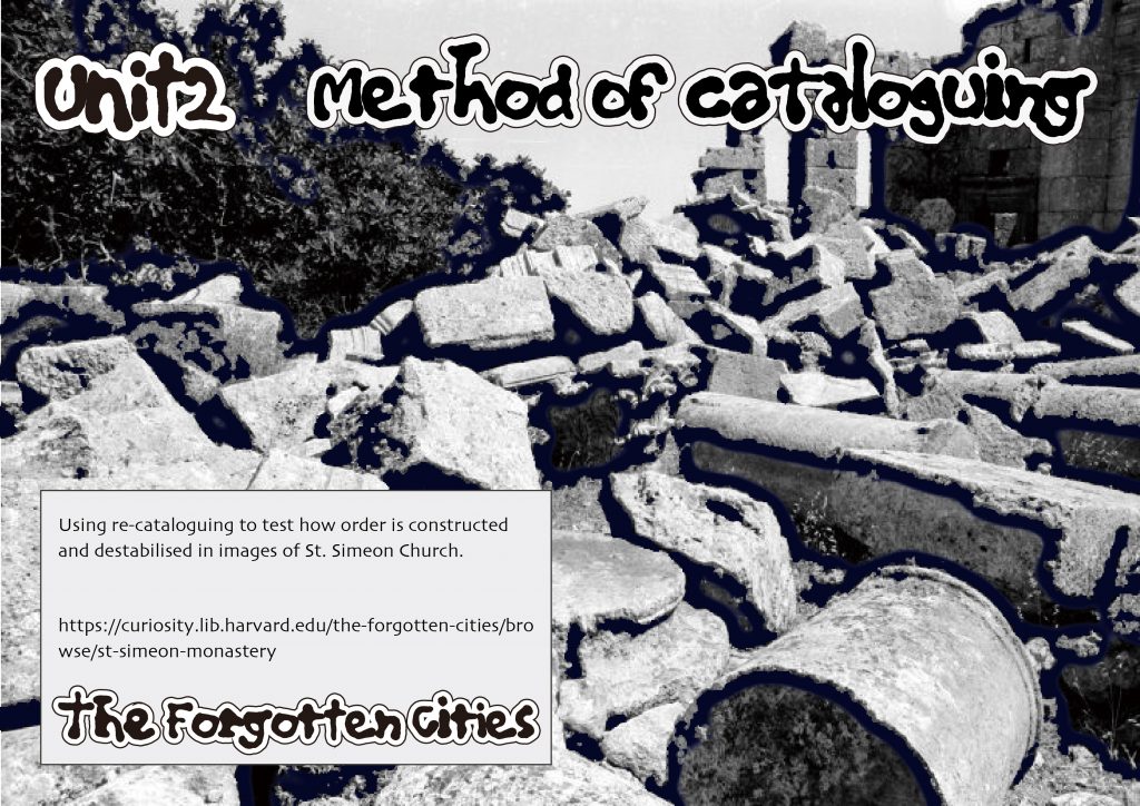
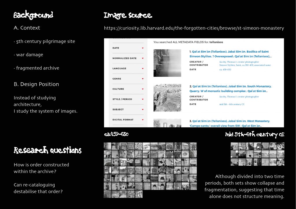
Based on https://curiosity.lib.harvard.edu/the-forgotten-cities/browse/st-simeon-monastery
Written response
Iteration of Risograph printing
This project began with an attempt to reproduce Howful Studio’s Risograph work with the utmost accuracy. The most striking aspect wasn’t the visual composition, but rather the inconsistency of the printed results. Even using the same files and machine, each print produced subtle but noticeable differences. Each paper feed caused registration misalignment, the ink density varied across different papers, and direct calibration on the machine actually exacerbated the deviations. These experiences raised the question: why would a tool designed for reproduction produce variations in repetitive operations? Rather than viewing these inconsistencies as technical malfunctions, the reproduction process should be considered as a system influenced by mechanical motion, ink properties, and paper absorbency.
During the replication stage, despite attempts at precise calibration, misalignment repeatedly occurred when using the Risograph printer, sometimes even worse than not using the calibration function at all. This phenomenon raised some questions about the control, repeatability, and consistency of the Risograph machine replication system.
One effective way to understand this is to draw on Conditional Design: Workbook by Luna Maurer et al., which frames design as a process-based practice in which outcomes emerge from a set of conditions rather than from a fixed form. This view helped me understand my Risograph experiment, which did not result in a failed copy due to calibration issues, but rather a record of the printing system ‘s operation. (Maurer et al., 2013)
To address this problem, I designed a series of iterative experiments, intentionally “modifying ” the calibration process. Instead of directly correcting for misregistration, I treated alignment as a variable. I fixed all other conditions—format, content, color, paper, and printing order—and systematically adjusted the printing position with precise increments and decrements.
During the printing process, I observed that the alignment in each direction was not stable, not accidental for this particular machine, but rather followed a pattern. Adjusting the alignment to the left caused the pattern on the paper to shift downwards, while adjusting downwards caused the pattern to shift to the right, and so on, resulting in 90-degree shifts. These reversals of direction were not isolated events but repeated in a stable and predictable manner across multiple print runs.
This observation can be understood through the concepts of “emergence ” described in the Conditional Design: A Working Manual. The manual’s glossary defines “Emergence ” as an unexpected but recurring pattern. (Maurer et al., 2013)
This persistent directional shift does not indicate an error or loss of control, but rather an emergent pattern arising from the machine ‘s internal logic. In this sense, the control within the Risograph system is indirect and mediated. The screen interface provides a sense of spatial clarity, inside the machine but the actual results are derived through mechanical processes that remap the intent to different spatial outcomes.
This approach shifted my understanding of iteration from improvement to observation–the observation during the process. Instead of trying to stabilize the Risograph machine or force it to operate in a predictable way, I began to appreciate the value of accepting its inherent instability. Through repeated adjustments and comparisons, patterns that I couldn’t predict began to emerge. The goal of this experiment wasn’t to fix overprinting errors or regain control of the machine, but to treat uncertainty as a resource that could be utilized.
In the final stage, I expanded my experimentation by adding a layer of printing while maintaining the original colors, creating subtle depth through overlapping and overprinting. When presenting my images using the same medium, the images themselves are also affected by these conditions. Slight shifts in the image, overlapping layers, and sharpness are all influenced by the machine.
Presenting text through screen printing transforms it from a stable record into iterative physical traces. Meaning is no longer solely determined by language, but shaped by alignment and repetition.
Beyond printed outputs, I extended my enquiry through a digital prototype: an interactive simulation that models the calibration behaviour observed in my Risograph experiments (https://risointeration.cargo.site/).
This web tool allows users to adjust input directions and visually see how misalignment translates into different spatial translations. By rendering the same principles into an interactive system, the website functions as both a reading instrument and an analytic lens.
It is not a replacement for physical prints, but a way of externalising the patterns I discovered, turning them into a dynamic structure that can be explored beyond the limitations of a machine. In doing so, the simulation blurs the boundary between doing and writing—where interaction, visual feedback, and iteration participate equally in the formation of knowledge.
Reference:
Maurer, L., Edo Paulus, Puckey, J. and Roel Wouters (2013). Conditional design workbook. Amsterdam: Valiz.
Written Response
Reunion
My project is a visual translation of four short films by Stella Blackmon—”Alone,” “Arrival,” “Escape,” and “Reunion.” Instead of retelling her family story, I structured the publication around these 4 titles as emotional phases. My main question was: how can emotional states be interpreted visually? This project led me to see translation not just as changing words, but as a creative way to put together time, space, and feelings.
Adapting Blackmon’s film into print altered its meaning on multiple levels. As Queneau “uses everything that he finds in life for his poetry—and even things that he doesn’t find in life,” my publication also borrows from both real emotion and imagined rhythm. The process of translation becomes a poetic system rather than a descriptive one. Queneau, R (1981). In film, emotions are conveyed through performance, dialogue, and music. In print, however, emotions are experienced through space—rhythm, repetition, and materiality. I share Queneau’s resistance to the “calamitous and idiotic division” between enjoyment and thought. The publication seeks to merge emotional pleasure with critical reflection—inviting the viewer to feel and to think at the same time. Blackmon’s family life and community background in the Ozark Mountains are reinterpreted as a personalized psychological experience. While this translation subverts the original narrative structure, it generates new emotional resonance: loneliness becomes the norm, escape becomes a habit, and reunion becomes repetitive.The project also responds to what has been called the “neoliberal restructuring of media” that made experimental and essayistic cinema almost invisible.By translating these emotional narratives into a printed form, I attempt to give visibility to what is usually overlooked — small, personal moments that escape cinematic spectacle Hito Steyerl (2012). Instead of pursuing faithful reproduction, translation is viewed as a creative distortion—a way of rethinking how design presents rather than interprets emotions.
This project made me realize that translation can be a method of design creation. I learned how to handle emotion and form at the conceptual level, and how to use rhythm as a structural means. However, the relationship between text and image can be further integrated, and the cultural shift from Blackmont’s local context to my personal context can be more clearly demonstrated. In future development, I hope to further explore the translation of materials—using elements such as transparency, layering, or sound to extend this visual language into a multi-sensory experience.
In this project, translation is no longer a means of explanation, but a way of thinking. Each page is like a small act of translation—translating between images and words, solitude and connection, memory and form.
Reference list
Hito Steyerl (2012). Hito Steyerl : the Wretched of the Screen. Berlin, Germany: Sternberg Press.
Queneau, R. (1981). Exercises in Style. New Directions Publishing.
Rebuilding the forgotten cities
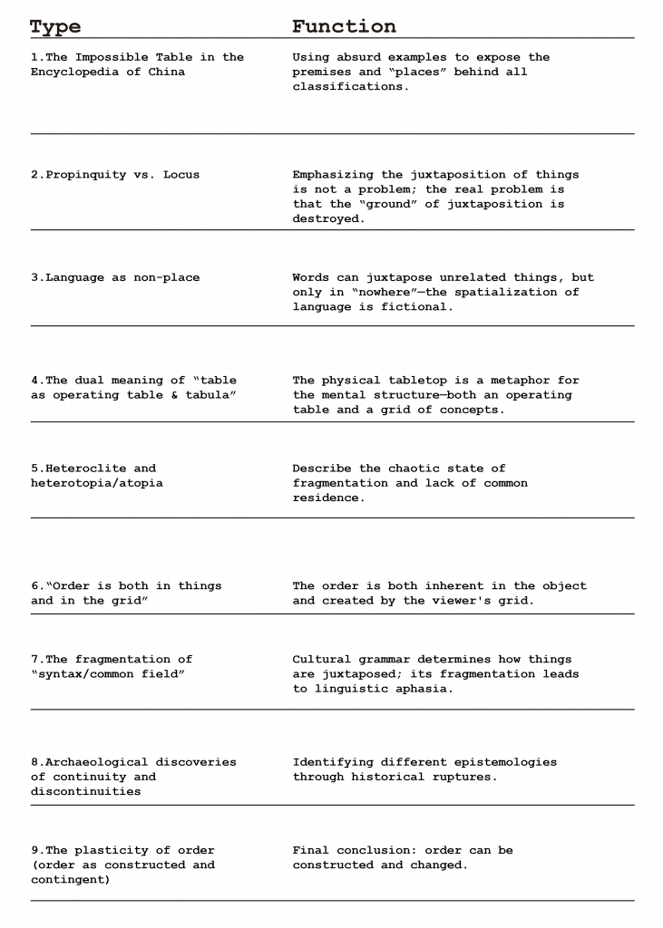
First,I read the “Preface” to Foucault’s The Order of Things as a list of “order.”
Each sentence categorizes, divides, and reconnects the world within language.My response transforms this movement into a list—a record of the construction of meaning through separation.
· List of order of the book
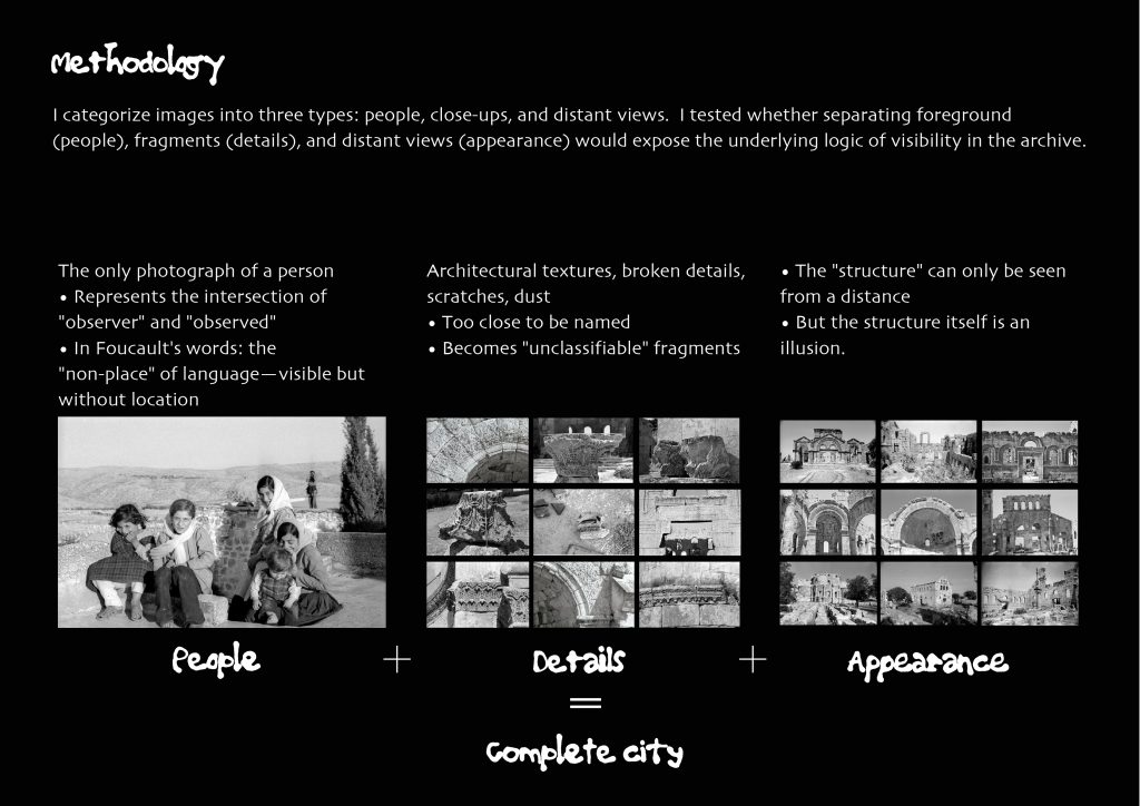
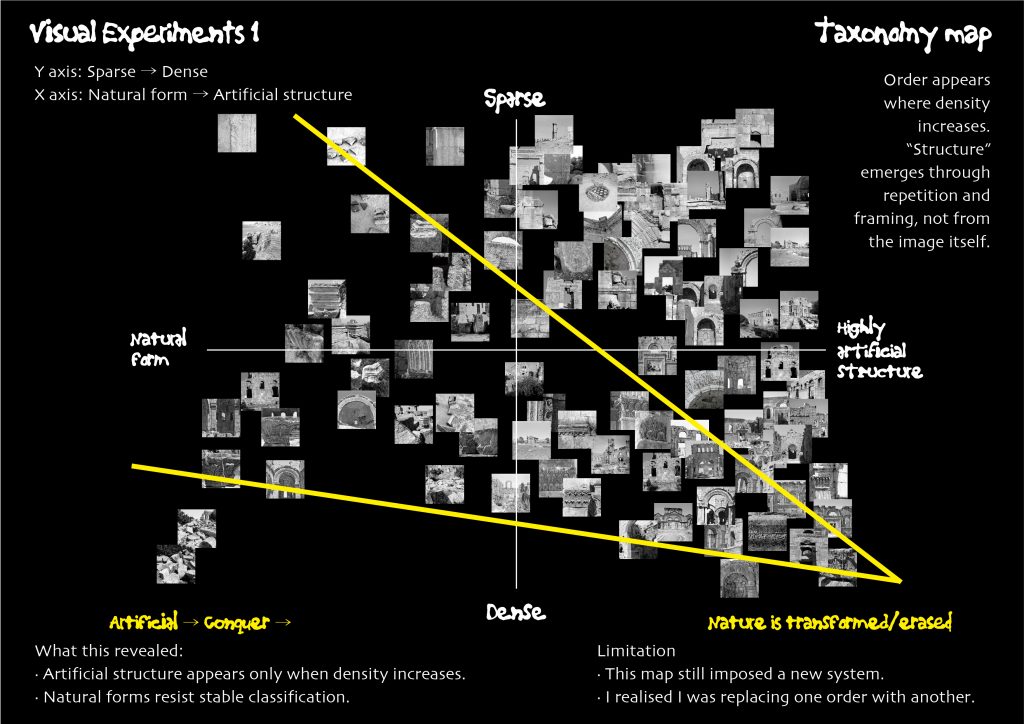
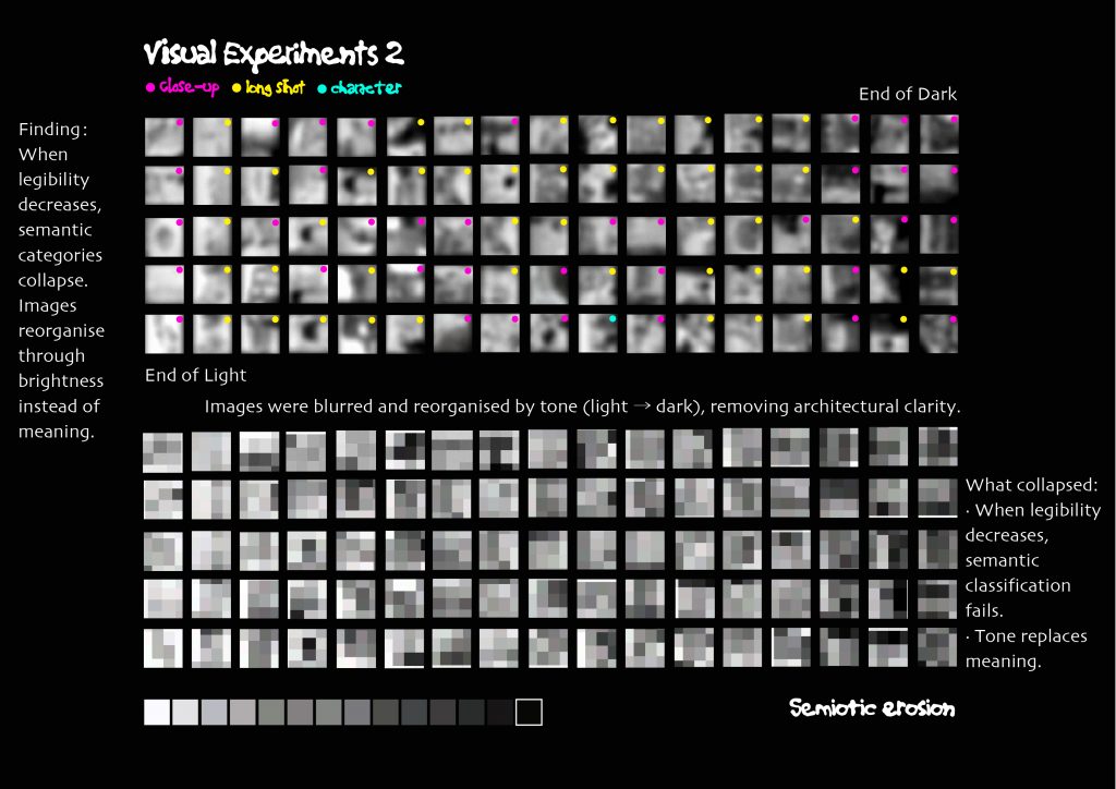
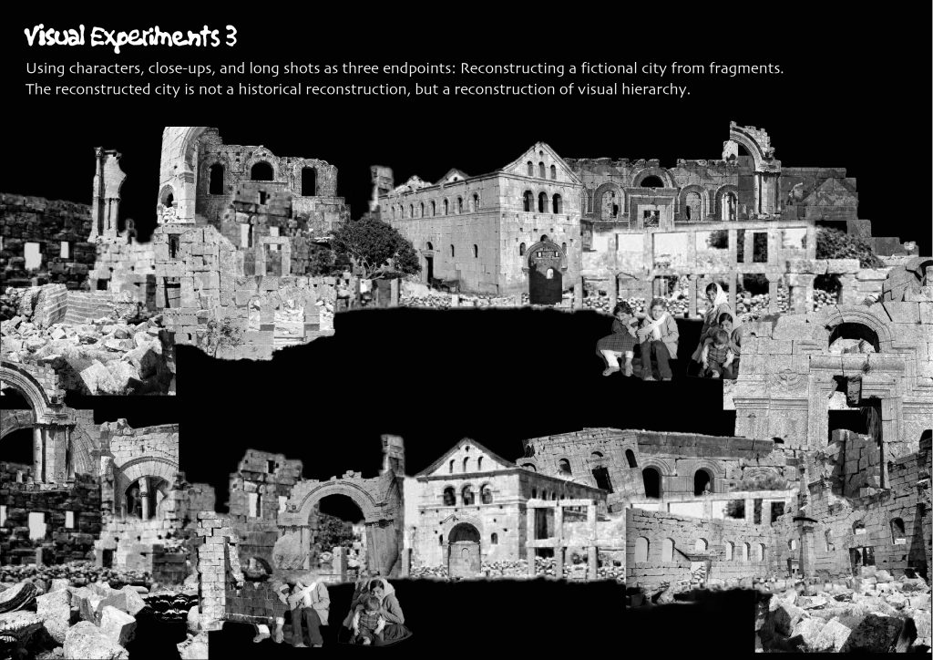
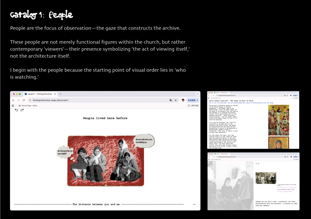
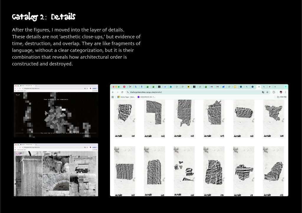
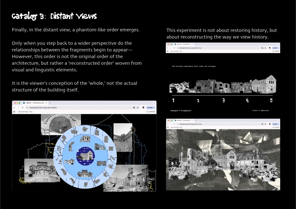
This profoundly influenced my approach to the San Simeon Church’s video archive. I no longer viewed it as a simple visual record, but rather as an “exercise in order”: Figures, close-ups, and distant views are not only layers of space but also layers of viewing and naming. I discovered that arrangement, labeling, and categorization are not simply methods of presentation but rather acts of design—actively creating meaning.
I revisited the archival footage of St. Simeon’s Church using the method of an “inventory.” Rather than analyzing it as architectural history, I wrote it down as a record—a catalog of fragments.
Each item is a unit of observation, a way of establishing connections between faith, war, and time. This inventory itself is a structure, a silent inquiry:
How is order designed, and how does it collapse?
· List of fragments
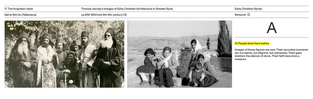
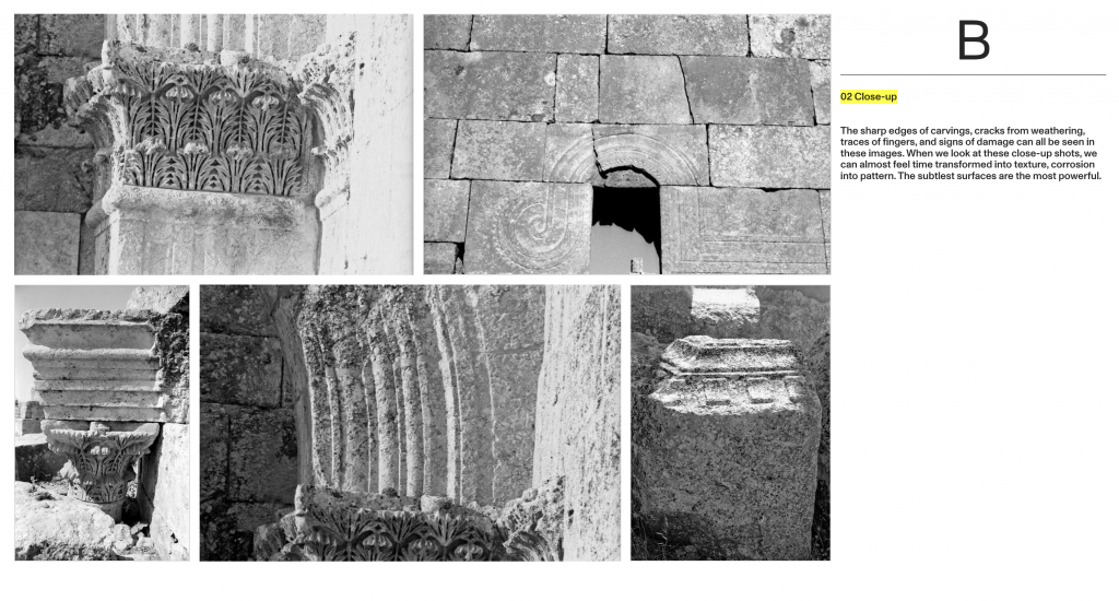
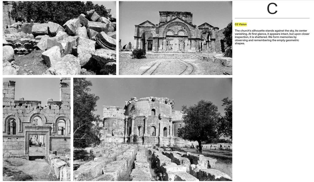
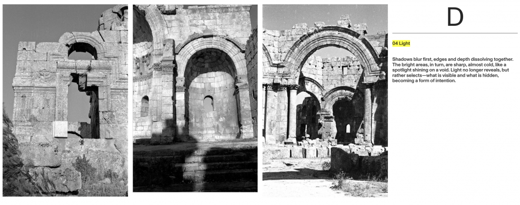
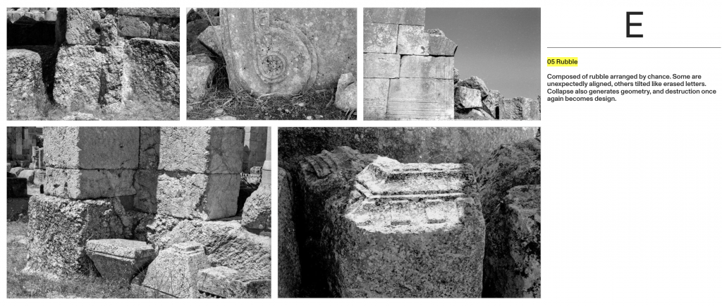

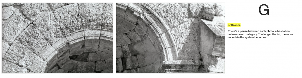
In my list, there’s no hierarchy among the fragments; their juxtaposition echoes Foucault’s concept of the “heteroclite”:Multiple orders flicker in the same space, unable to find a common home. Foucault, M. (1966)
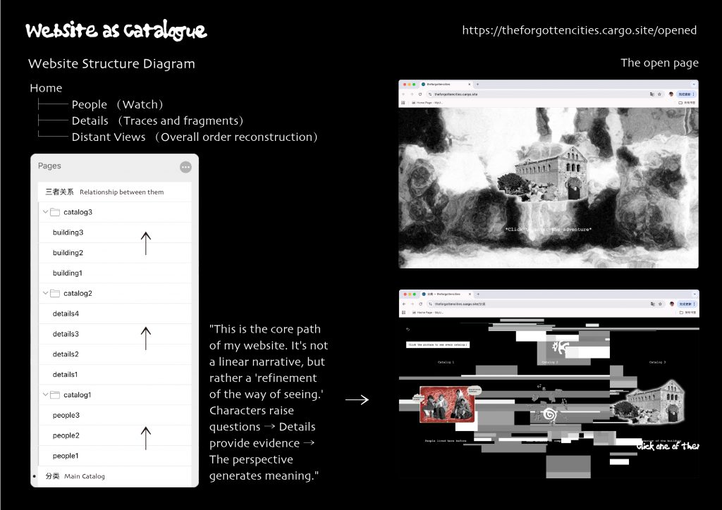
Thus, as I transformed my research into lists, I realized that categorization itself is a form of design. The logic of rhythm, spacing, and white space mirrors the structure of my website—from figures to buildings, from intimacy to distant vistas. https://theforgottencities.cargo.site/
The act of making lists became a kind of reconstruction, not of the church itself, but of a way of seeing. Ultimately, what I learned wasn’t how to restore order, but how to expose its instability—the way language, image, and design are constantly reconstructed and disintegrated, and knowledge is seen in these temporary structures.
Reference list
Foucault, M. (1966). The Order of things: an Archaeology of the Human Sciences. London: Routledge.
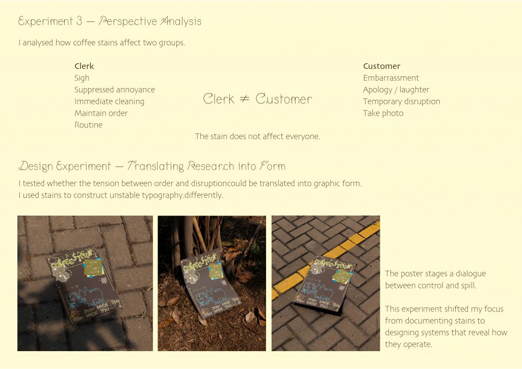
Coffee Stains: Traces of People’s Happiness
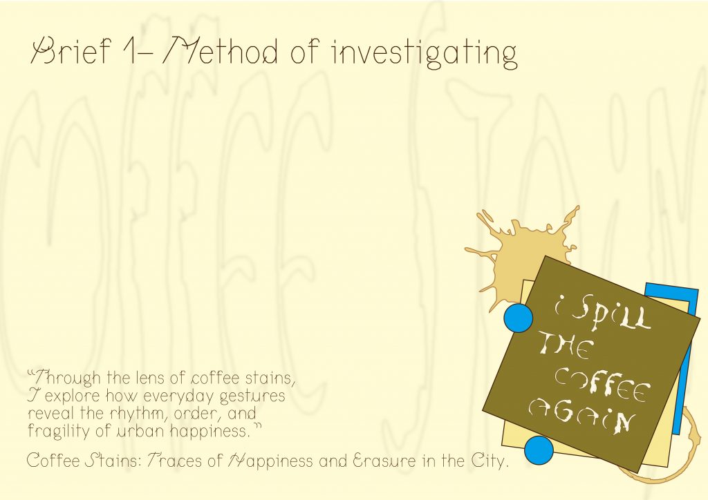
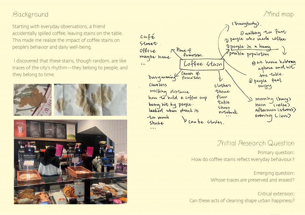
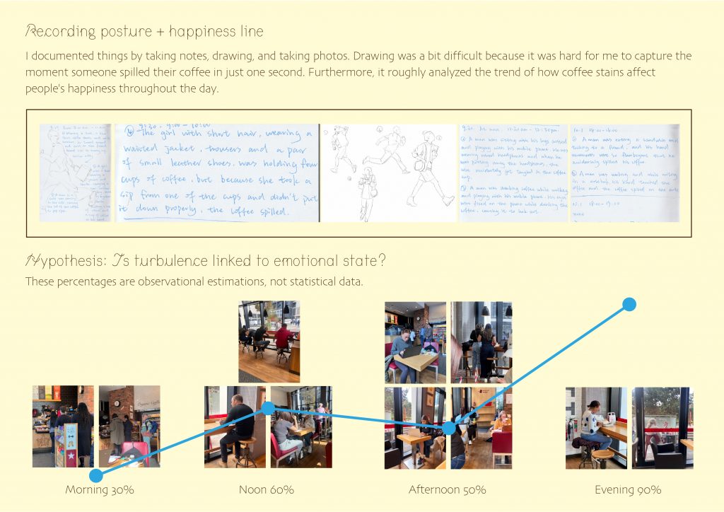
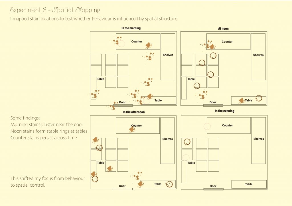
My project is about coffee stain. I spent these weeks observing a small coffee shop. I using scanning and photography to document the coffee stains that appeared at different hours of the day. Like Perec wrote, “Sitting in a café or walking in the street, notebook and pen in hand, I do my best to describe the houses, the shops and the people that I come across” (Perec and Sturrock, 1997, p.47). I try to keep something before it’s wiped away — a small proof that I was there.Each mark—whether a splash, a ring, or a blur—was a residue of movement: a gesture, a pause, a mistake. Documenting these coffee stains allow me to transform them into graphics, to truly connect with the place. As the brief said, graphic design can be a tool that we can seem as a form of inquiry—a tool for looking and thinking critically in our daily life.
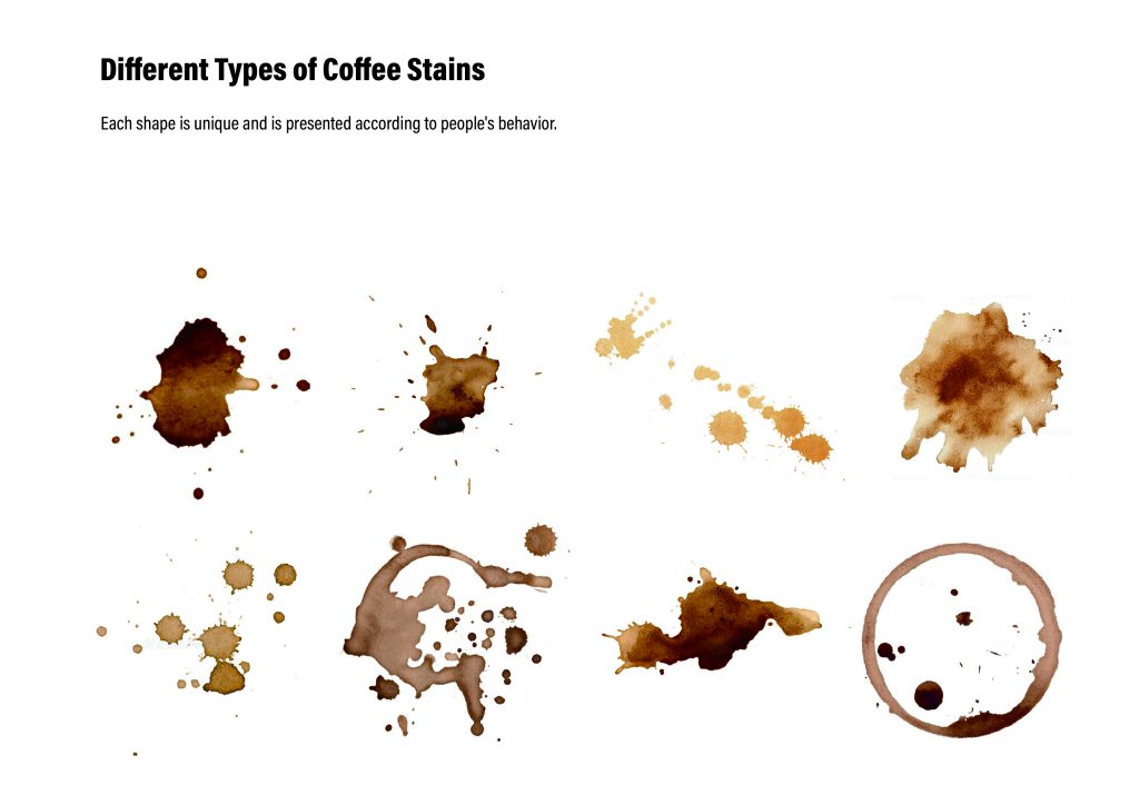
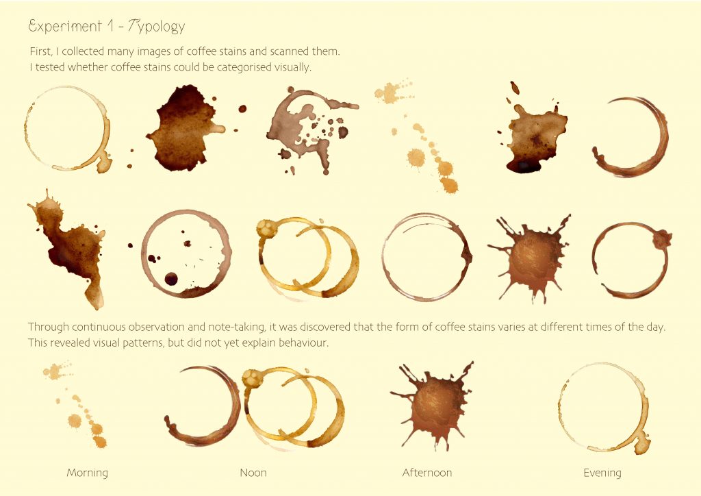
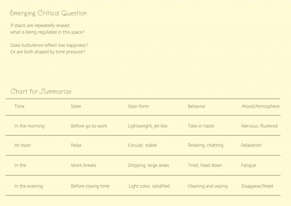
In the morning, coffee stains looked like jet-like patterns; At noon, they accumulate like circles, layer upon layer; In the evening, they become almost nonexistent; And at night, they vanish completely under the cleaner’s mop. Through this pattern, I began to interpret the coffee shop as a system of visibility,
documenting the locations of coffee stains showed at what place in the coffee shop and the movements of the cleaners. As Perec said when observing the streets and bus routes in Paris:
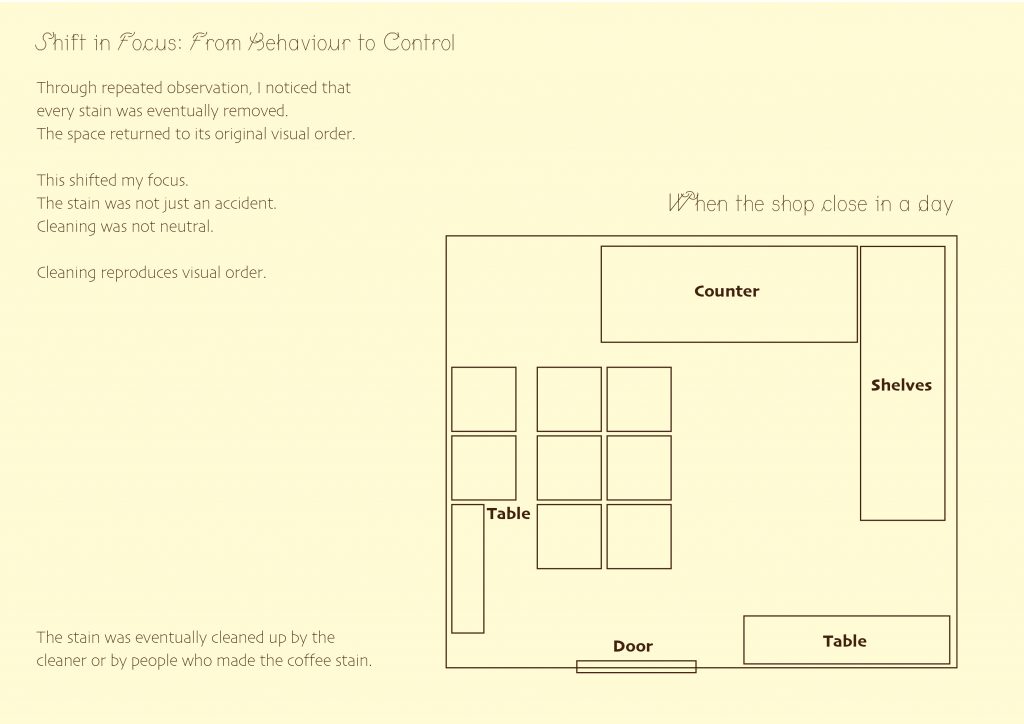
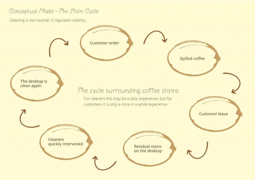
“Decipher a bit of the town. Its circuits: why do the buses go from this place to that? Who chooses the routes, and by what criteria?” (Perec , 1997). My observations in the coffee shop also adopted a similar logic: the appearance and disappearance of coffee stains seemed to record the“routes” and rules of this space. I discovered that what remains and what disappears are not neutral decisions but reflections of social order. The cleaners’ labor ensures the visual and experiential comfort of others while leaving no visible trace of themselves. Therefore, the removal of stains exposes the level of existence—whose traces are tolerated and whose are erased.
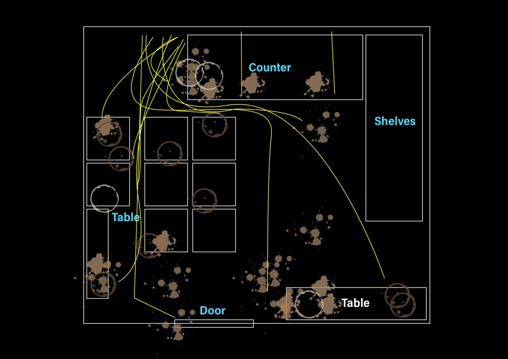
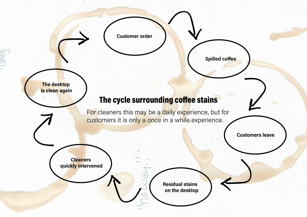
When I compared these cycles to people’s shifting moods throughout the day, I discovered that coffee stains grow larger as the sense of happiness and disappear as calm returns. Some people don’t think their moods would change after spilling coffee. So I think the mood changing by coffee stain still depend on the individual. Cleaners are the most affected by coffee stains, requiring repeated wiping, day after day, to maintain others’ happiness. Therefore, happiness is less a feeling than a controlled state, maintained through constant erasure.
Through these investigations, I’ve become more aware of how fragile and short the traces we left. Watching a coffee stain fade feels like watching a memory fade. It made me think about how much our “clean” urban lives rely on hiding the messy that proves our presence. Perhaps this brief has led me to consider graphic design as a way to preserve these subtle traces of life—to draw our attention to them before they disappear.
Reference list
Georges Perec and Sturrock, J. (1997). Species of spaces and other pieces : Georges Perec. London: Penguin.
Written by Moye Liu in method of investigating