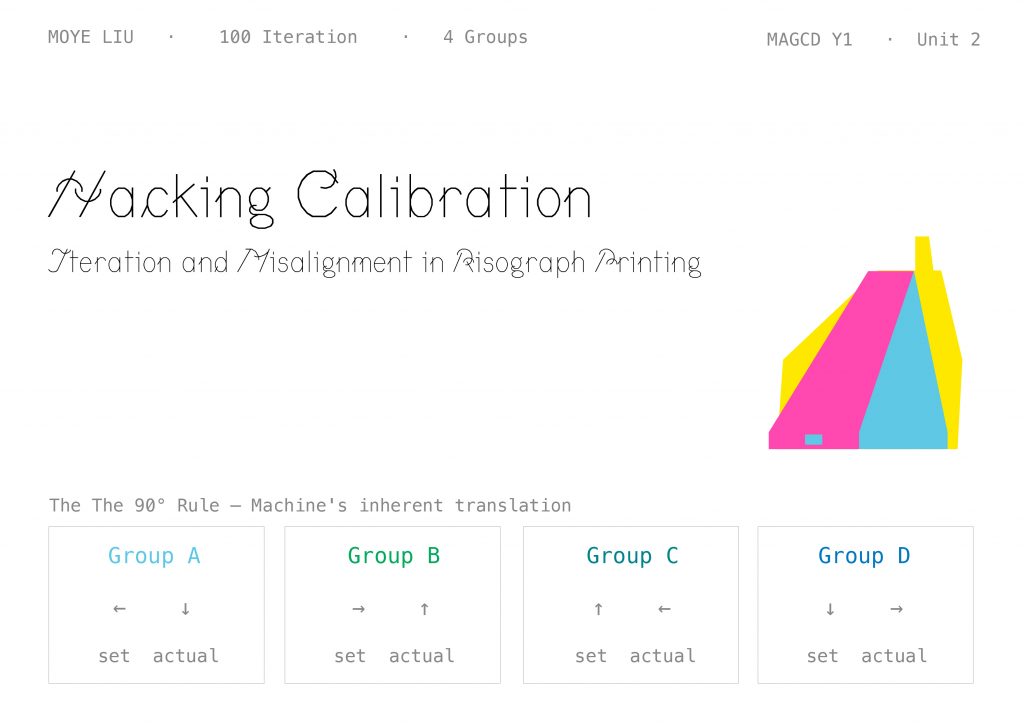
My Unit 2 project is called Hacking Calibration
— Iteration and Misalignment in Risograph Printing. It’s a 100-iteration printmaking project about machines, misalignment, and treating “error” as a subject. Over the next seven minutes I’ll take you through its starting point, the decisions behind it, the system it became, and the questions it’s opening up.
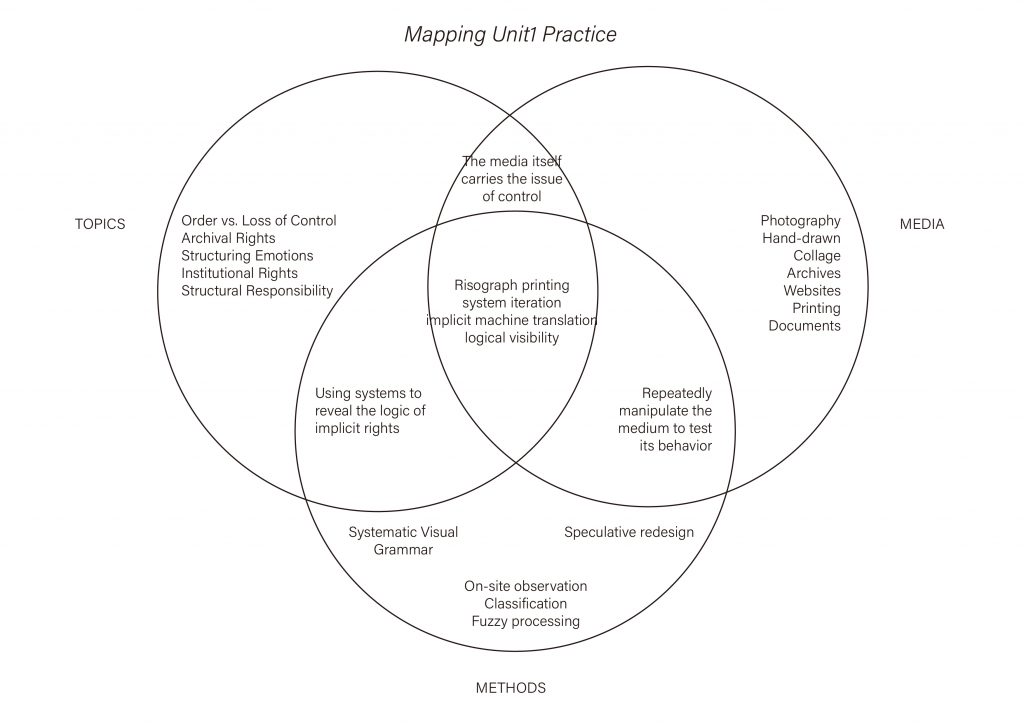
So look back to Unit 1. The topics I’ve been working with
Order vs Loss of Control, Archival Rights, Institutional Rights are all about one thing: how power gets quietly embedded into systems. Along the way I tried a lot of media: photography, hand-drawing, collage, archives, websites, print, documents. But the one medium where topic, media, and methods truly converge is Risograph printing. Because Riso itself carries a hidden logic
the medium itself is the question of control. It isn’t just a way of printing; it’s a whole system I have to move with before I can see it. That’s why I chose it as the vehicle for all of Unit 2.
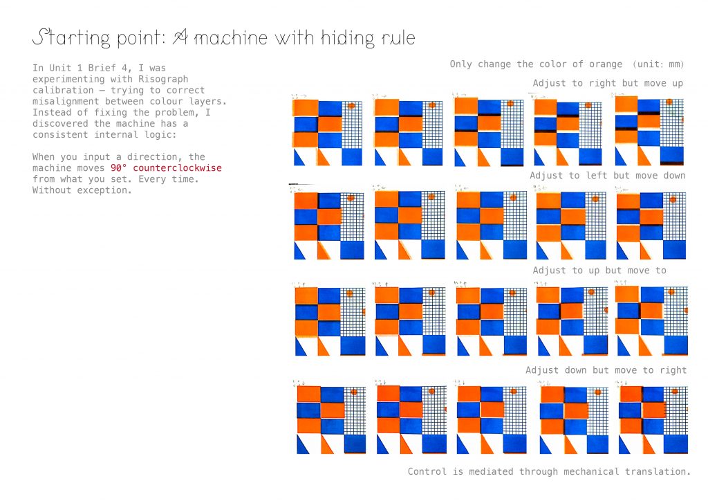
The real starting point was a “failure” from Unit 1 Brief 4. I was trying to calibrate the Riso — to line the colour layers up — and no matter what I did, they wouldn’t match. After many attempts I realised the machine wasn’t broken. It had its own rule: When you input a direction, it outputs that direction rotated 90° counterclockwise. Every time. Without exception. Tell it to go left, it goes down. Tell it to go right, it goes up. The moment I wrote that down, the misalignment stopped being an error — it became the machine’s own translation system. “Error” turned into “subject.” That’s the first real seed of Unit 2.
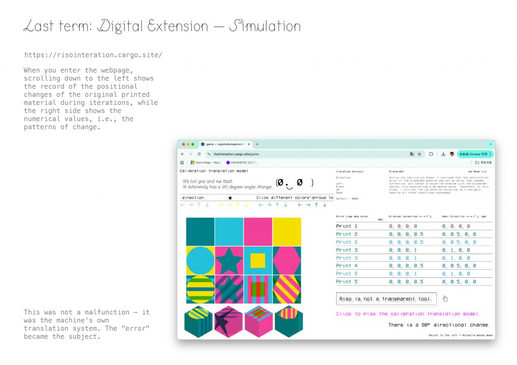
Last term I built this logic into a web simulation — risointeration.cargo.site. The left side shows the positional shift of each print across iterations; the right side shows the numerical values behind it. That’s where I first wrote down the line — Riso is not a transparent tool. It looks direct, but every step carries a layer of hidden translation. That sentence became the starting point for all of Unit 2.
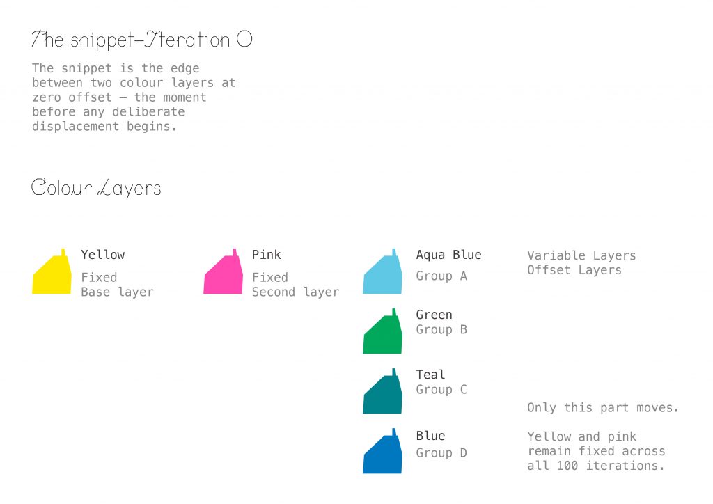
When Unit 2 began, the first thing I looked for was the smallest unit — the snippet. It’s the edge between two colour layers at zero offset — the moment just before any deliberate displacement begins. I set up a three-layer structure: Yellow as the fixed base; Pink as the fixed second layer; and a third layer that changes by group — Aqua Blue for Group A, Green for B, Teal for C, Blue for D. Across all 100 iterations, only the third layer moves. Yellow and Pink are my baseline.
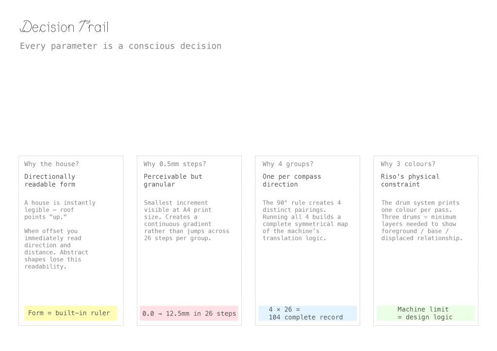
So those are my decision trail. Why 0.5 mm? It’s the smallest increment the eye can still perceive at A4 scale. Across 26 steps it reads as a continuous gradient instead of visible jumps. Why four groups? Because the 90° rule produces exactly four directional pairings. Running all four is a complete, symmetrical map of the machine’s translation logic. Why only three colours? Because of Riso’s physical limit — the drum system prints one colour per pass, and three drums is the minimum needed to show foreground, base, and displacement together. Machine limit = design logic. The machine’s constraint becomes the grammar of the design.
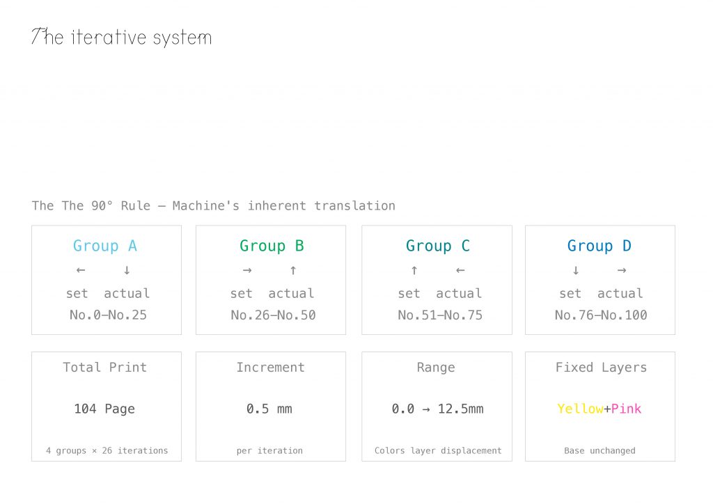
The system looks like this: Group A is set ← / actual ↓, numbered No.0–25; Group B is → / ↑, No.26–50; Group C is ↑ / ←, No.51–75; Group D is ↓ / →, No.76–100.
Plus four edition pages — 104 pages in total. Each step is 0.5 mm, ranging from 0.0 to 12.5 mm. Yellow and Pink stay completely fixed across all pages. The only variable is the third layer’s displacement.
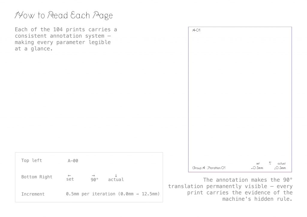
Every print carries the same annotation system. Top-left: the iteration ID, from A-00 to D-25. Bottom-right: three fields — set → 90° → actual — written out explicitly. Which means: even if you only hold a single print in your hand, you can reverse-engineer the entire rule. The annotation isn’t decoration — it keeps the machine’s hidden logic permanently visible.
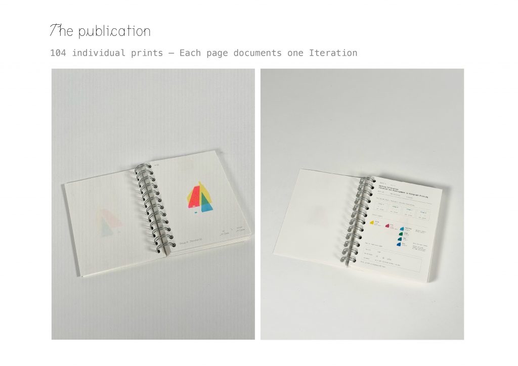
The final physical form is a 104-page spiral-bound publication. One iteration per page, so turning the pages is literally a replay of the machine’s translation. If you flip through the pages quickly, it’s like a comic book; you can clearly see the movement patterns.
Those hundred pages couldn’t answer.
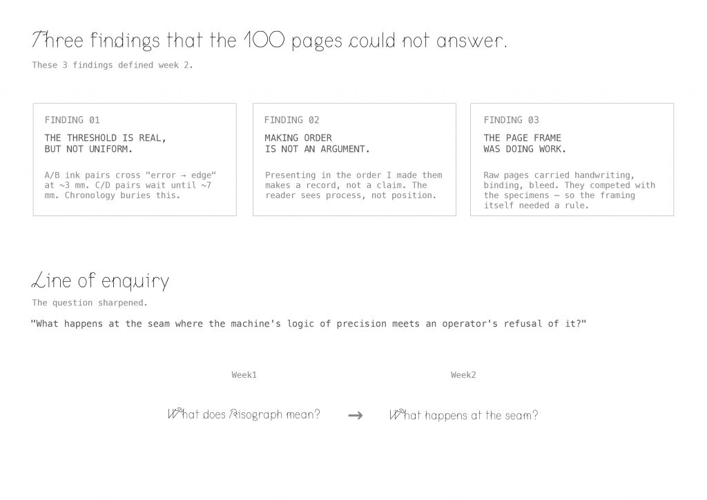
Three findings:
One — the threshold is real, but not uniform. A and B ink pairs cross from “error” to “edge” at around 3 millimetres. C and D pairs don’t cross until about 7. Chronology buries this.
Two — making order is not an argument. Presenting the iterations in the order I made them produces a record, not a claim. The reader sees process, not position.
Three — the page frame was doing work. Raw pages carried handwriting, binding, bleed — they competed with the specimens. So the framing itself needed a rule.
These three findings defined Week 2. They let me sharpen the question. Last week I was asking: what does Risograph mean? This week, I’m asking — what happens at the seam, where the machine’s logic of precision meets an operator’s refusal of it?
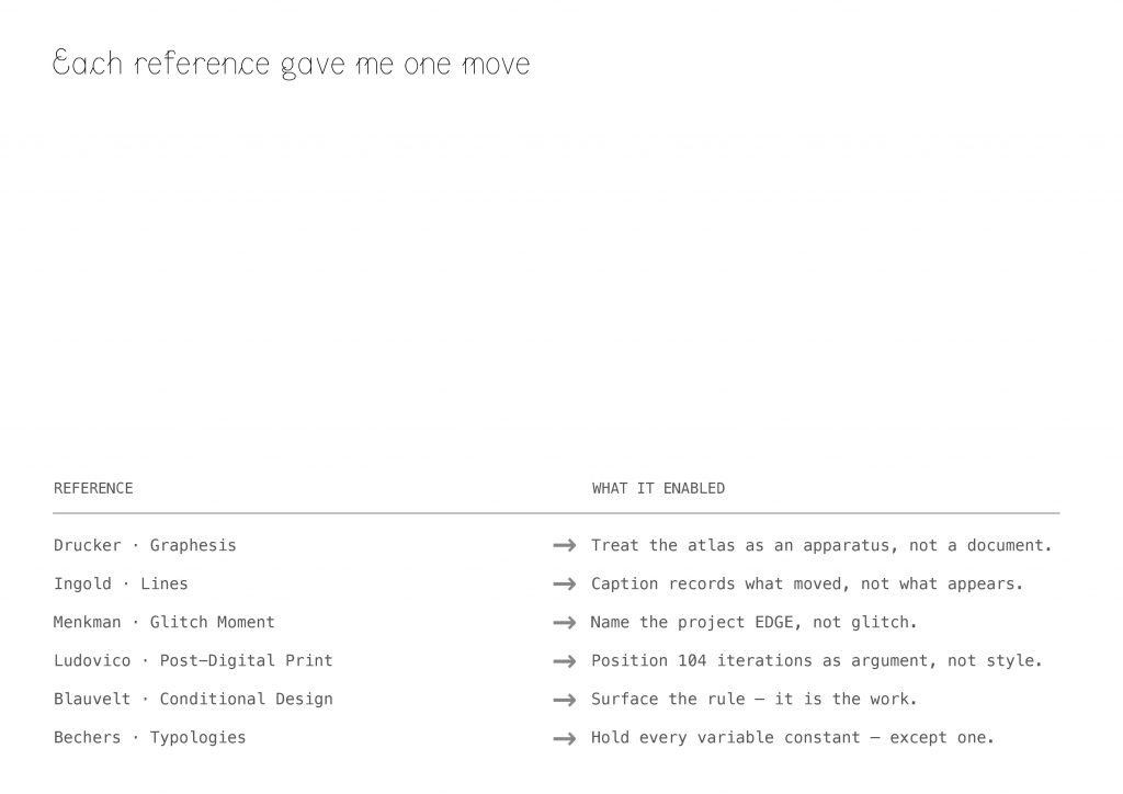
I find six reference this week, and each one turned into one concrete move.
Drucker’s Graphesis taught me that the atlas isn’t a document of my iterations — it’s an apparatus that produces misalignment as a subject.
Ingold’s Lines told me the caption should record what moved, not what appears.
Menkman’s Glitch Moment(um) framed the glitch as productive rupture — but I depart from her, because the Riso’s edge stays sharp. That’s why I named the project EDGE, not glitch.
Ludovico let me position the 104 iterations as an argument about print, not a stylistic exercise. The Conditional Design workbook pushed me to surface the rule — the rule is the work. And the Bechers gave me the deepest protocol of all: hold every variable constant, except one.
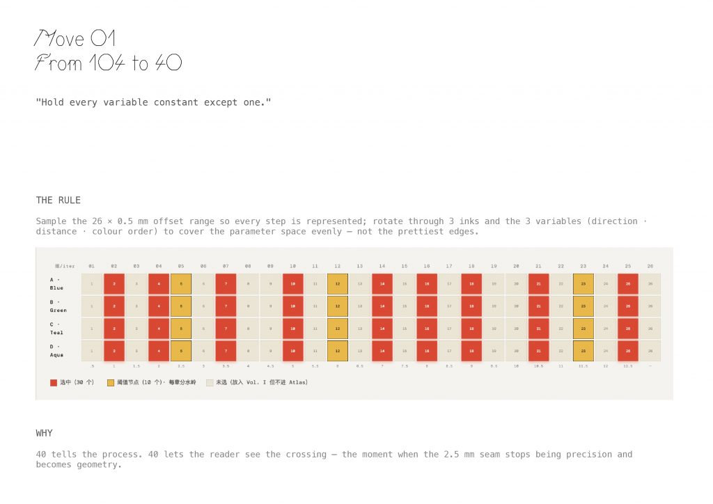
Move One: from 104 to 40.
The rule — I sampled the 26-step × 0.5 mm offset range so every step is represented. I rotated through 3 inks and 3 variables — direction, distance, colour order — to cover the parameter space evenly. Not the prettiest edges.
Why 40? 40 lets the reader see the crossing — the moment when the 2.5-millimetre seam stops being precision and becomes geometry.
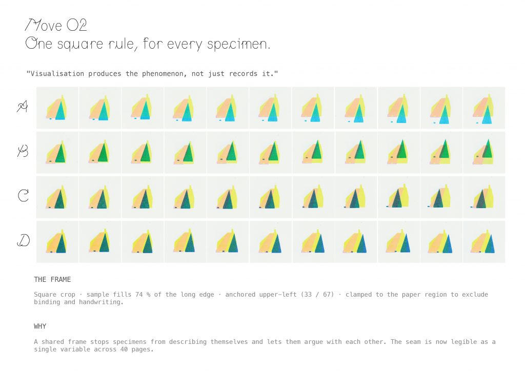
Move Two: one square rule for every specimen.
Drucker’s line was the compass: visualisation produces the phenomenon, not just records it.
The frame — square crop, sample fills 74 % of the long edge, anchored upper-left at 33 / 67, clamped to the paper region to exclude binding and handwriting.
Why — a shared frame stops specimens from describing themselves and lets them argue with each other. The seam is now legible as a single variable across 40 pages.
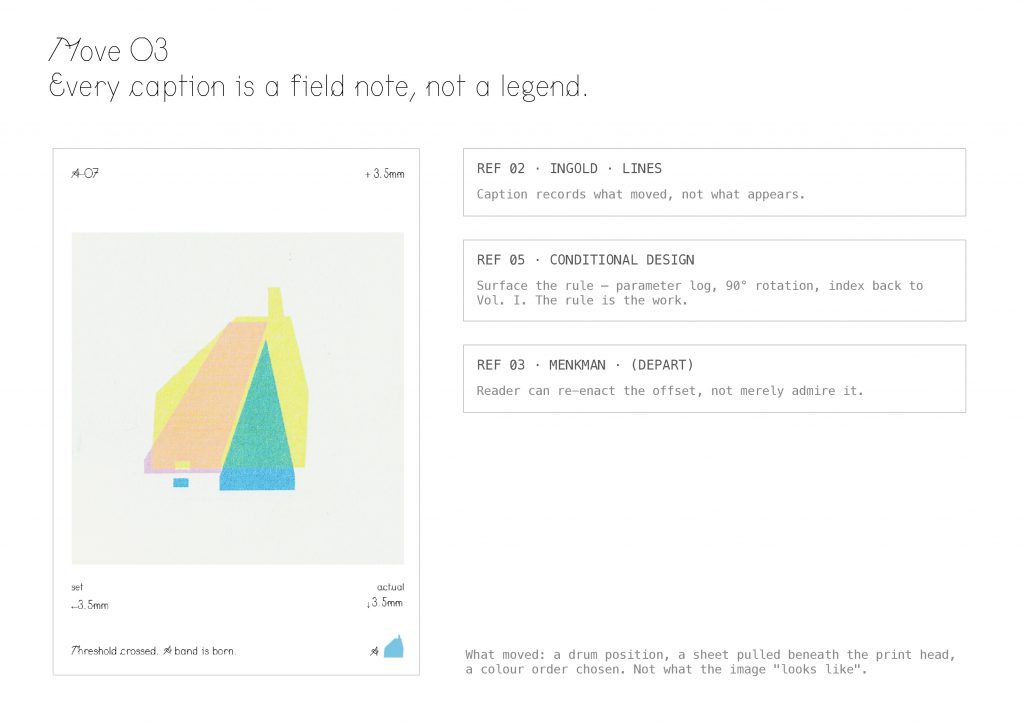
Move Three: every caption is a field note, not a legend.
Following Ingold, the caption records what moved — a drum position, a sheet pulled beneath the print head, a colour order chosen. Not what the image looks like.
Following Conditional Design, I surface the rule itself — parameter log, 90-degree rotation convention, an index back to Volume One. The rule is the work.
And here’s my departure from Menkman: the reader can re-enact the offset, not merely admire it.
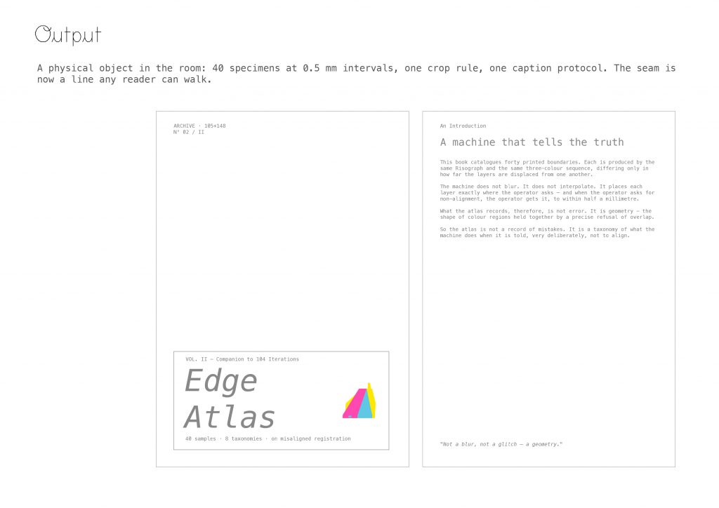
This is the object. Printed and bound this week. Edge Atlas 40 specimens at 0.5-millimetre intervals, one crop rule, one caption protocol. The seam is now a line any reader can walk.
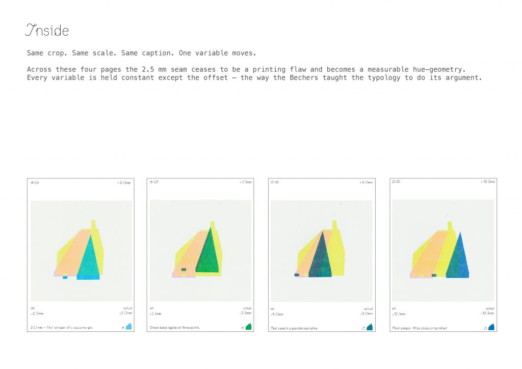
Same crop. Same scale. Same caption. One variable moves. Across these four pages and across all 40 the 2.5-millimetre seam ceases to be a printing flaw and becomes a measurable hue-geometry. Every variable is held constant except the offset. This is the way the Bechers taught typology to do its argument.
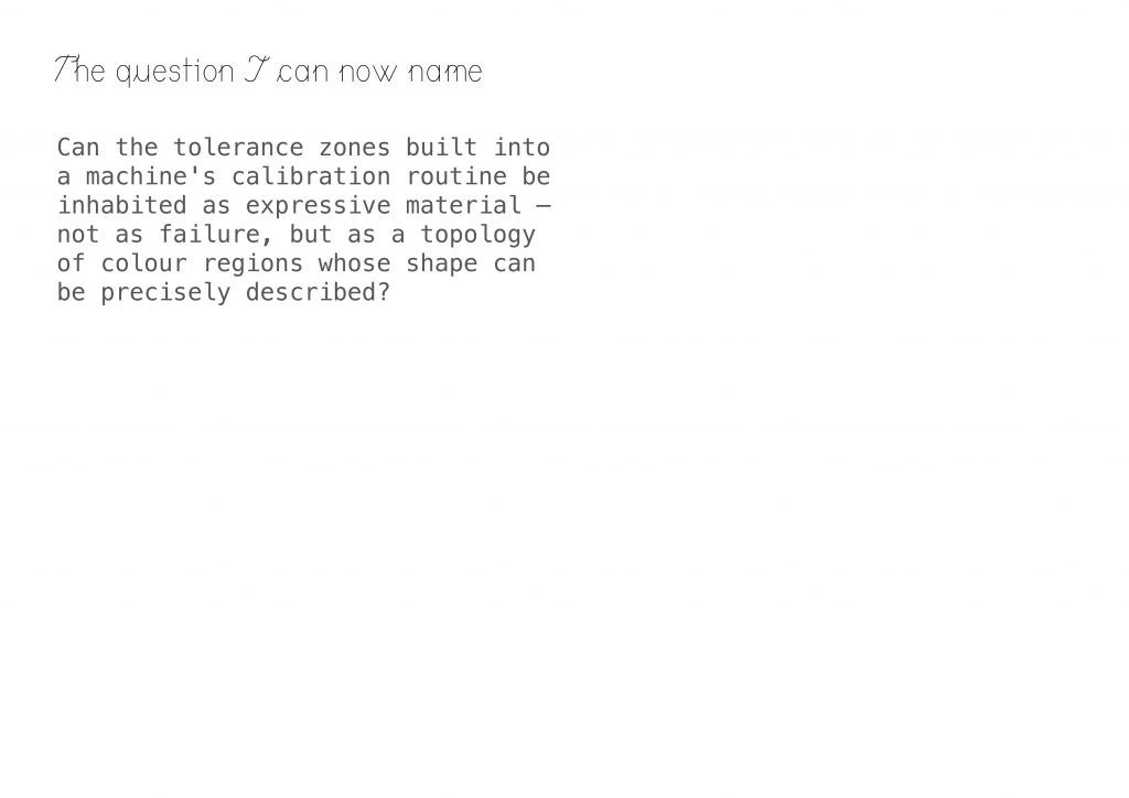
It lets me name the question properly.
Can the tolerance zones built into a machine’s calibration routine be inhabited as expressive material — not as failure, but as a topology of colour regions whose shape can be precisely described?
Leave a Reply